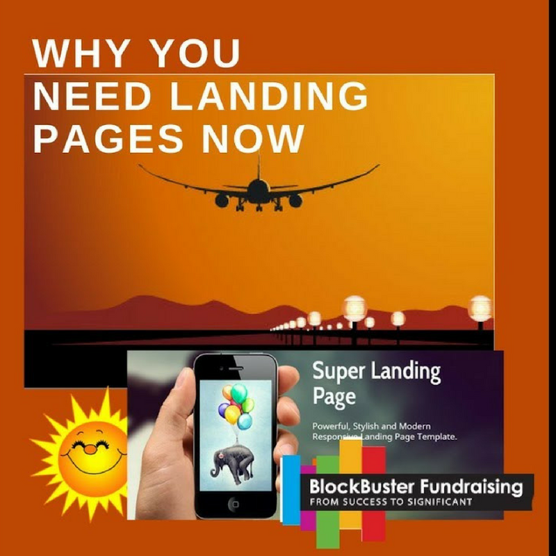
You have time to get your year-end landing pages done to seamlessly integrate with your final emails and final DM appeal, so let’s get started!
A well planned Landing Page interacts with your specific Call-To-Action to instill Donor ease and confidence. Here at Blockbuster Fundraising, we believe that many super successful #GivingTuesday campaigns employed landing pages that did just that, connected the donor and the cause with comfort and no confusion to completion of the gift. You have time to get your year-end landing pages done to seamlessly integrate with your final emails and final DM appeal, so let’s get started! Landing Pages are used as Thank You’s also, as in #GivingTuesday: this is super timely from Ann Green: https://anngreennonprofit.com/2017/12/05/donating-online-shouldnt-feel-like-a-transaction/
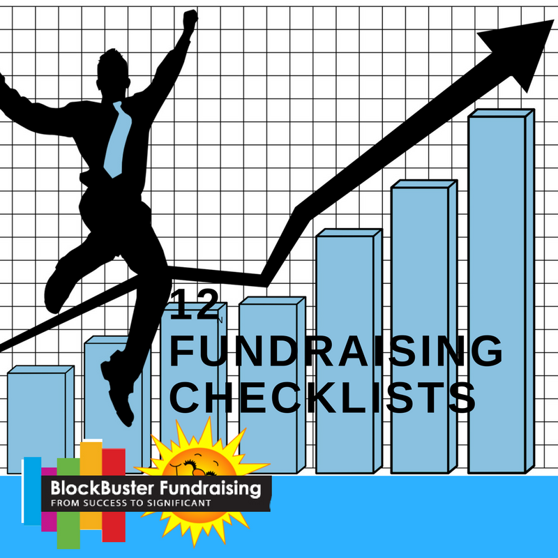
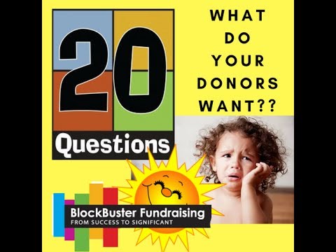
12 fundraising checklists that will take your year-end fundraising to huge heights so you’ll definitely want to review and check off each detail!
Blockbuster is all about bringing all the very best fundraising tips to one place where you can spend minutes a day, reviewing, refreshing and learning from the most excellent fundraising leaders globally available. Today’s Facebook LIVE presents 12 fundraising checklists that to be best you want to review and check off each detail! Save and watch in October so your plans are complete and completely super ready for fab 2017 success!
Website Check Up
October is the perfect time to get your website ready for year-end success! 270 million Americans use the internet daily on any number of devices. For great advice on how to improve your website, watch now.
Be Mobile Friendly
Did you know that more than half of your internet traffic is coming from mobile devices but that only a third of websites are mobile responsive? Make sure your website looks good on your mobile. It must be neat, simple, organized, and have great content. And it must have a prominent donate now button. Do a mobile friendly test like the one available from Google, to make sure it works perfectly.
Keep Them On Your Site!
Don’t surprise your visitor with cumbersome external sites. You want to keep potential donors on your website while they are entering their donation information.
Get First Time Visitors Involved
Create a way first-time visitors can communicate with you. Have a newsletter sign up or an opt-in page for first time visitors so they stay connected. This will make them more likely to come back and make a donation.
Are They Ready?
Visitors who click the “donate now” button on nonprofit sites are usually ready to make a donation. First time donation page visitors are 44% more likely to give than previous visitors. So keep them there the first time they visit with an easy to use, easy to find Donate Button.
Create a Landing/Campaign Page
To retain and grow your supporters, engage and inform your website visitors about the progress of your campaigns and projects. Your supporters want real time updates to feel connected and to entice them to continue supporting our project. A great way to do this is by creating a campaign page that your donors can visit to keep up with your goals, progress, and successes.
Don’t disregard BabyBoomers
Many of us think of baby boomers as non-internet users. But the fact is, our baby boomers are spending an average of 38 hours a month online. In fact, 70% of baby boomers have a Facebook account.
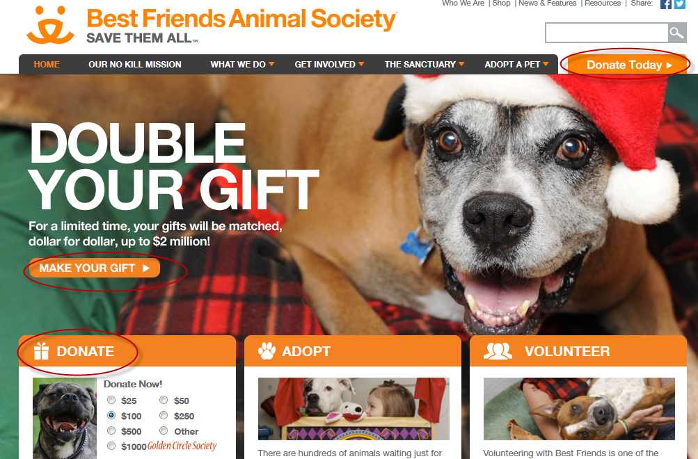
Donate Now Button!!!
This is the most important action item! Make sure you have a prominent donate now button. It should be way up on top, and easy to use. If potential donors have to search for your donation page, they’ll move on and make their donation elsewhere.
What You Need to Know Now About Donor Communications
Here are more Donor Communication Questions you need to know the answers to! Do you know what % of US charitable income is now raised online? Do you know if Direct Mail still works? And do you know how long your appeal letter should be for best results? Watch now for these answers and more!
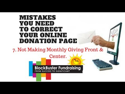
A blog I read and admire struck a chord. Here are 9 Donation Page Mistakes you need to be certain you’re not making (the link to the blog is below). Today we explore Mistake #7 (Not Making Monthly Giving Front & Center) and how to fix it!
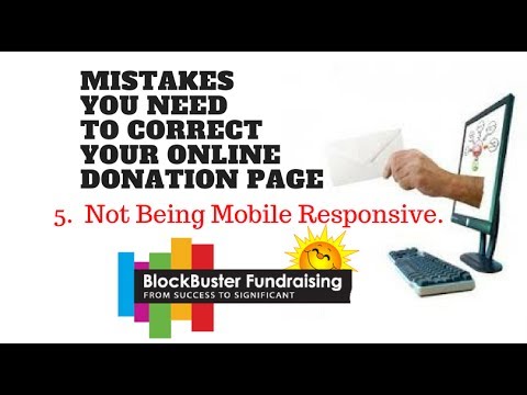
A blog I read and admire struck a chord with this short blog. Here are 9 Donation Page Mistakes you need to be certain you’re not making (the link to the blog is below). Today we explore Mistake #5 (Not Being Mobile Responsive) and how to fix it!
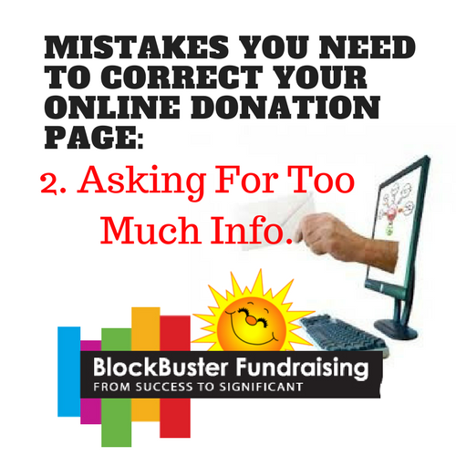
A blog I read and admire struck a chord with this short blog. Here are 9 Donation Page Mistakes you need to be certain you’re not making (the link to the blog is below). Today we explore Mistake #2 (Asking For Too Much Information) and how to fix it!
#SUMMERLEARNINGSERIES
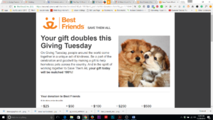
Dec 30th! Today we review an exemplary 2016 year-end email and remind ourselves that a call to donors about the last chance IRA 2016 deduction could be important! Hope your emails are year-end asks are having fabulous results! Join us tomorrow for a live New Years Eve celebration with resolutions and trends for 2017.
Make all Donate or Give Now buttons easy to see, simple to use, and at least one above the fold.
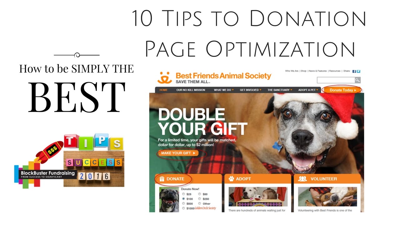
Brand your Donation Page! Place the same photo that is associated with the ask on the donor page so donors feel comfortable they are in right spot.
Make certain your page loads with good speed. Ask your webmaster for help! Speed is important as are all links working right.
Make sure that you remain on your own page when hit donate button! Don’t let your donors click and end up on another site. Ask your webmaster for help as this is so important!
Make your fields simple and minimal. don’t ask for their life history. Everyone is in a hurry and worried about privacy.